New Components Explained
This page provides examples and clear explanations for all our custom components, so everyone understands their functionality and usage.
Text With Button
Component: TextWithButton
Description: Displays a text prompt with an actionable button that links to a resource. Perfect for highlighting downloadable files or external links.
Required Import:
import TextWithButton from "@site/src/components/TextWithButton";
Live Example:
Need the quick-reference PDF version of the Incident‑Response Cheat‑Sheet?
Download PDF<TextWithButton
text="Need the quick-reference PDF version of the Incident‑Response Cheat‑Sheet?"
buttonLabel="Download PDF"
buttonHref="#"
/>
Role Badge
Component: RoleBadge
Description: Renders a badge showing a role's name along with optional icons and colors. Use it to visually represent staff roles or permissions. NEW: Now includes automatic color presets for common roles!
Required Import:
import RoleBadge from "@site/src/components/RoleBadge";
Live Examples:
With Custom Color:
@Potato
With Auto Color Presets:
@Moderator @Helper @Admin @Event Host @lolmaxz

Available Preset Colors:
- Department Positions: Lewd Governor (#db1cb8), Admin (#db1cb8), HR (#2a6eef), Committee Members (#db1cb8), Event Committee (#00e6c3)
- Event Team Heads: Event Team Head (#f75edb), Head Moderator (#db1cb8), Head of Security (#3fa7ff)
- Event Team: Senior Event Team (#ffc857), Event Host (#a259f7), Event Security (#ff5e5b), Event Team Trial (#3fa7ff)
- Staff Roles: Moderator (#e68027), Helper (#38c8e8)
- Staff Members: lolmaxz, krenki, s4.ryn, Solii, verbaldrop, nightmarediztydoo, defovr, zerohour1998, cobramaia, vervacious_ (#00B9ff)
// Custom color (overrides preset)
<RoleBadge role="Potato" badgeIcon="admin_role_icon.png" color="#db1cb8" />

// Auto color preset (no color needed!)
<RoleBadge role="Moderator" />
<RoleBadge role="Helper" />
<RoleBadge role="Admin" />
<RoleBadge role="Event Host" />
<RoleBadge role="lolmaxz" />

// Custom color still works
<RoleBadge role="Moderator" color="#ff0000" />
Channel Badge
Component: ChannelBadge
Description: Creates a clickable badge that links to a specific channel and supports variants to visually distinguish between channel types.
Required Import:
import ChannelBadge from "@site/src/components/ChannelBadge";
Live Example:
Make sure to read the Rules channel rules before posting in the introductions channel.
Here are some examples of Channel Tags:
Rules ticket‑9876 introductions 💦 Horny Time// Regular channel badge
<ChannelBadge
label="Rules"
link="https://discord.com/channels/734595073920204940/737074569319546921"
/>
// Variant badge for posts
<ChannelBadge
variant="post"
label="introductions"
link="https://discord.com/channels/734595073920204940/737074569319546921"
/>
// Ticket (Thread) example
<ChannelBadge
variant="thread"
label="ticket‑9876"
link="https://discord.com/channels/734595073920204940/737074569319546921"
color="#248046"
/>
// Voice Chat example
<ChannelBadge
variant="vc"
label="💦 Horny Time"
link="https://discord.com/channels/734595073920204940/737074569319546921"
/>
Checklist
Component: Checklist
Description: Organizes a list of checklist items for process verification or step-by-step tasks. In addition to styling individual items, the Checklist supports a custom color option that affects the border, checkboxes, and filling bar.
Required Import:
import Checklist from '@site/src/components/Checklist';
Live Example with Color Picker (see below):
ID & Selfie Verification
0/6 completed
<Checklist checklistId="demo" title="ID & Selfie Verification" borderColor="#800080">
  <Checklist.Item id="selfie-one-id">Selfie with one ID</Checklist.Item>
  <Checklist.Item id="id-issuer-visible">• Issuer (government / state / country) is visible</Checklist.Item>
  <Checklist.Item id="id-dob-visible">• DOB is visible</Checklist.Item>
  {/* Additional checklist items */}
</Checklist>
Tooltip
Component: Tooltip
Description: Wraps text to provide additional hover information. Customizable colors and an option to remove default text decorations enhance clarity.
Required Import:
import Tooltip from "@site/src/components/Tooltip";
Usage Examples:
- Without Decoration:
Live Example:
Underlined Text<Tooltip bubbleColor="blue" noDecoration="true" tip="Text Decoration is optional, but turned on by default!">
Underlined Text
</Tooltip>
- Colored Tooltip and Text:
Live Example:
Amazing colored texti can be used.
<Tooltip tip="The Color of the Text and the bubble can be customized independently." bubbleColor="#248046" labelColor="#34d399">
  colored text
</Tooltip>
- Default Tooltip:
Live Example:
Default Text bubblei
<Tooltip tip="Simply specify the tip and the default color (#5865F2) will be applied.">Text bubble</Tooltip>
Command Card
Component: CommandCard
Description: Displays a card containing detailed information about a command, including required permissions and tooltip information.
Required Import:
import CommandCard from "@site/src/components/CommandCard";
Live Example:
/banBans the mentioned user and deletes their last 24 h of messages. Note: Ensure that the permission provided is valid for the icon to appear.
<CommandCard cmd="/ban" perms="Moderator" cardColor="indigo">
  Bans the mentioned user and deletes their last 24 h of messages.
</CommandCard>
Audit Flag
Component: AuditFlag
Description: Marks recent updates or audit events with a flag indicator. It supports three types of flags: NEW (items recently added), CHANGED (modified items), and DEPRECATED (items no longer recommended or to be removed).
Required Import:
import AuditFlag from "@site/src/components/AuditFlag";
Live Examples:
-
New Audit:
NEW Slash-command bulk-ban added. -
Changed Audit:
CHANGED Updated user permission hierarchy. -
Deprecated Audit:
DEPRECATED The old moderator panel is now deprecated.
// New Audit
<AuditFlag type="NEW" />

// Changed Audit
<AuditFlag type="CHANGED" />

// Deprecated Audit
<AuditFlag type="DEPRECATED" />
Role Matrix
Component: RoleMatrix
Description: Presents a matrix that compares various roles and the actions/permissions they have. It is especially useful for quickly understanding role responsibilities.
Required Import:
import RoleMatrix from "@site/src/components/RoleMatrix";
Live Example:
| Pin | Ban | Mute | |
|---|---|---|---|
| Helper | ✅ | — | — |
| Mod | ✅ | — | ✅ |
| Admin | ✅ | ✅ | ✅ |
<RoleMatrix
  actions={["Pin", "Ban", "Mute"]}
  data={[
    { role: "Helper", actions: ["Pin"] },
    { role: "Mod", actions: ["Pin", "Mute"] },
    { role: "Admin", actions: ["Pin", "Ban", "Mute"] },
  ]}
/>
Timestamp
Component: Timestamp
Description:
Converts a Unix timestamp following Discord's exact format to a human-readable date/time format. It adjusts to the reader's local time, continuously refreshes for authenticity, and mimics Discord's dynamic timestamp design.
Any timestamp created with the website hammertime is also compatible. You can use strings like <t:1747208640:F> for a full date/time format or <t:1747208640:R> for a relative time format.
Required Import:
import Timestamp from "@site/src/components/Timestamp";
Live Examples:
The full event time:
Time since event:
Time since event:
// Full date/time format
<Timestamp value="<t:1747208640:F>" />

// Relative time format
<Timestamp value="<t:1747208640:R>" />

<Timestamp value="<t:1747254420:R>" />
DiscordButton
Component: DiscordButton
Description: Inline Discord-style buttons for actions, links, and more. Supports type, color, emoji, link, and disabled states. Color option can be added on any buttons, it will override the default color of the type of button.
Required Import:
import DiscordButton from "@site/src/components/DiscordButton";
Live Examples:
🔗Link Button<DiscordButton type="primary" emoji="🎉">Primary Button</DiscordButton>
<DiscordButton type="success" emoji="✅">Success Button</DiscordButton>
<DiscordButton type="secondary" emoji="💬">Secondary Button</DiscordButton>
<DiscordButton type="destructive" emoji="⚠️">Destructive Button</DiscordButton>
<DiscordButton type="link" href="https://example.com" emoji="🔗">Link Button</DiscordButton>
<DiscordButton color="#ff00ff" emoji="✨">Custom Color</DiscordButton>
<DiscordButton type="primary" emoji="⏳" disabled>Disabled Button</DiscordButton>
CardGrid & Card System 🆕
Components: CardGrid & Card
Description: A flexible system for displaying content in organized cards. Cards can be used individually or grouped in grids for side-by-side layouts.
ℹ️When to Use Each Component
- Single Card: Use
<Card>alone for individual content blocks (stretches a single card to the width of the page) - Multiple Cards: Use
<CardGrid>to arrange 2-4 cards side by side - Grid Required: Only needed when you want cards on the same line
Required Import:
import CardGrid, { Card } from "@site/src/components/CardGrid";
Basic Usage
Single Card (No Grid Needed):
📝Single Card
This card works perfectly on its own without any grid container!
Simple 2-Column Comparison: columns={2}
✅Accepted Documents
- Driver's License
- Passport
- State ID
❌Not Accepted
- Student ID
- Work Badge
- Library Card
3-Column Process Steps: columns={3}
📝Step 1
Upload your documents
⏳Step 2
Wait for review (36 hours)
✅Step 3
Get verified!
4-Column Status Types: columns={4}
✓Success
Approved items
✗Error
Rejected items
⚠Warning
Needs attention
ℹInfo
Helpful tips
Status Types:
success- Green checkmark (✓)error- Red X (✗)warning- Yellow warning (⚠)info- Blue info (ℹ)
❓ What Status Cards Do: Status cards automatically add color and icon indicators with styling to show different states. No need to specify an emoji, it will be added automatically.
Clickable Card Example:
🔗Clickable Card
Entire card is clickable! Click anywhere to navigate.
Card Options
Icons & Status
- Custom Icon:
<Card title="My Card" icon="📝">- Shows your emoji - Status Only:
<Card title="Success" status="success">- Shows automatic ✓ - Custom + Status:
<Card title="Warning" status="warning" icon="⚠️">- Custom overrides auto
Quick Templates
Single Card (No Grid):
<Card title="My Card" icon="📝">
  <p>Single card content</p>
</Card>
Show Result
📝My Card
Single card content
2-Column Comparison:
<CardGrid columns={2}>
  <Card title="Good Option" status="success" icon="✅">
    <p>Your content here</p>
  </Card>
  <Card title="Bad Option" status="error" icon="❌">
    <p>Your content here</p>
  </Card>
</CardGrid>
Show Result
✅Good Option
Your content here
❌Bad Option
Your content here
3 & 4 Column Examples
3-Column Process Steps:
<CardGrid columns={3}>
  <Card title="Step 1" icon="1️⃣">
    First step
  </Card>
  <Card title="Step 2" icon="2️⃣">
    Second step
  </Card>
  <Card title="Step 3" icon="3️⃣">
    Third step
  </Card>
</CardGrid>
Show Result
1️⃣Step 1
First step
2️⃣Step 2
Second step
3️⃣Step 3
Third step
4-Column Status Types:
<CardGrid columns={4}>
  <Card title="Success" status="success">
    <p>Approved items</p>
  </Card>
  <Card title="Error" status="error">
    <p>Rejected items</p>
  </Card>
  <Card title="Warning" status="warning">
    <p>Needs attention</p>
  </Card>
  <Card title="Info" status="info">
    <p>Helpful tips</p>
  </Card>
</CardGrid>
Show Result
✓Success
Approved items
✗Error
Rejected items
⚠Warning
Needs attention
ℹInfo
Helpful tips
Clickable Cards:
<CardGrid columns={2}>
  <Card title="Documentation" href="/docs" icon="📚">
    <p>Read the full guide</p>
  </Card>
  <Card title="Support" href="/help" icon="💬">
    <p>Get help here</p>
  </Card>
</CardGrid>
Each section above shows a live example alongside a code snippet, making it easy to see how each component can be used in your project.
Spoiler (Discord‑style) 🆕
Component: Spoiler
Description: Hides inline text with a black background until clicked (or toggled with Space/Enter). When revealed, a faint grey background remains to indicate it was spoilered. Width stays stable so layout doesn’t shift.
Required Import:
import Spoiler from "@site/src/components/Spoiler";
Live Examples:
Default hidden, click to reveal:
This message contains a secret detail you can reveal.
Pre‑revealed (start open):
already visible but still markedCustom colors (optional):
high contrast spoiler// Default usage
This message contains a <Spoiler>secret detail</Spoiler> you can reveal.
// Start open
<Spoiler revealed>already visible but still marked</Spoiler>
// Optional custom colors
<Spoiler background="rgba(0,0,0,.9)" color="#fff">high contrast spoiler</Spoiler>
Discord Conversation 🆕
Components: DiscordConversation & DiscordMessage
Description: Creates a Discord-style chat interface perfect for showing example conversations, ticket interactions, or ban vote threads. Automatically handles message grouping, timestamps, reactions, mentions, and highlights.
Required Import:
import DiscordConversation, { DiscordMessage } from "@site/src/components/DiscordConversation";
Live Examples:
Basic Conversation:


<DiscordConversation id="test-basic-conversation" title="Example Conversation">
  <DiscordMessage name="Moderator 1" color="#e68027" message="Hi there! How can I help you today?" />
  <DiscordMessage name="Member 1" color="#5865f2" message="I have a question about the server rules." />
  <DiscordMessage name="Moderator 1" color="#e68027" message="Of course! What would you like to know?" />
</DiscordConversation>
With Reactions:
<DiscordMessage
  name="Moderator 1"
  color="#8b5cf6"
  message="Vote here within next 24hrs on server ban of [MemberName]."
  reactions={[
    { emoji: "✅", count: 9, selected: true },
    { emoji: "❌", count: 1 },
  ]}
/>
Multi-line Content (Lists Auto-detected):
<DiscordMessage name="Moderator 1" color="#8b5cf6">
  [MemberName] has committed following problems: - Non sexual consent break - Over intoxication in several events - Making people
  uncomfortable
</DiscordMessage>
Auto-highlighted @Moderator mentions:
<DiscordMessage name="Moderator 1" color="#8b5cf6" message="@Moderator please review this case." />
Key Features:
- Auto-timestamps: Automatically generates realistic timestamps if not provided
- Message grouping: Messages from the same author automatically group together (no avatar/timestamp repeated)
- List detection: Lines starting with
-automatically become bullet lists - Mention styling:
@mentionsare automatically styled in Discord blue - Auto-highlight: Messages containing
@Moderatorare automatically highlighted - Reactions: Support up to 4 reactions with emoji, count, and selected state
- Discord fonts: Uses Discord's official font stack for authentic appearance
Available Props:
DiscordConversation:
title(optional): Header text for the conversation
DiscordMessage:
name(required): Username to displaycolor(optional): Username color (default: white)message(optional): Message content (use this ORchildren)children(optional): Message content as children (preferred for multi-line)timestamp(optional): Custom timestamp stringminutesOffset(optional): Auto-generate timestamp X minutes agoreactions(optional): Array of reaction objects{ emoji, count, selected? }highlighted(optional): Force highlight on/off (auto-detected for @Moderator)avatar(optional): Custom avatar URL
Content With Thumbnail 🆕
Component: ContentWithThumbnail
Description: Displays content alongside a thumbnail image in a side-by-side layout. Perfect for showcasing screenshots, diagrams, or visual examples alongside explanatory text. Automatically stacks vertically on mobile devices for better responsiveness.
Required Import:
import ContentWithThumbnail from "@site/src/components/ContentWithThumbnail";
Live Examples:
Basic Usage:
This component displays content alongside a thumbnail image. The content area is flexible and can contain any React elements, including text, lists, and other components.
The thumbnail appears on the right side (or bottom on mobile) and automatically scales to fit while maintaining its aspect ratio.

With List Content:
Key Features:
- Responsive layout that stacks on mobile
- Automatic image sizing and border styling
- Flexible content area for any React content
- Clean, professional appearance

// Basic usage
<ContentWithThumbnail thumbnail="docusaurus.png" thumbnailAlt="Docusaurus logo">
  <p>This component displays content alongside a thumbnail image.</p>
  <p>The thumbnail appears on the right side and automatically scales to fit.</p>
</ContentWithThumbnail>

// With list content
<ContentWithThumbnail thumbnail="logo.svg" thumbnailAlt="Site logo">
  <p><strong>Key Features:</strong></p>
  <ul>
    <li>Responsive layout that stacks on mobile</li>
    <li>Automatic image sizing and border styling</li>
    <li>Flexible content area for any React content</li>
  </ul>
</ContentWithThumbnail>
Available Props:
thumbnail(required): Path to the thumbnail image relative tostatic/img/directorythumbnailAlt(optional): Alt text for the thumbnail image (default: empty string)children(required): Content to display alongside the thumbnail (can be any React elements)
Layout Behavior:
- Desktop: Content on the left, thumbnail on the right (200px width)
- Mobile: Stacks vertically with thumbnail on top, content below
- Image: Automatically maintains aspect ratio and includes border styling
Responsive Screenshot
Component: ResponsiveScreenshot
Description: Displays handbook screenshots with a Desktop | Mobile toggle. Paths are relative to static/img/ (use slashes for subfolders). On page load, the initial view follows the visitor's viewport (max-width: 768px → mobile when a mobile image exists).
Required Import:
import ResponsiveScreenshot from "@site/src/components/ResponsiveScreenshot";
Live Example:
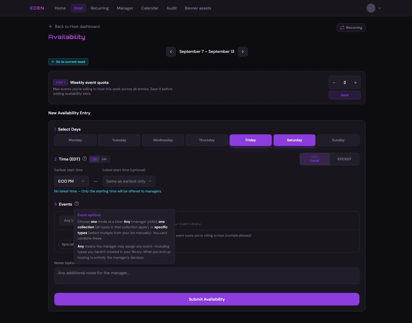
// Desktop + auto-detected mobile (`{src}_mobile.webp`)
<ResponsiveScreenshot
  src="scheduler/11-host-availability-add-slot"
  alt="Host availability form with days and time range"
  caption="Optional caption below the image."
/>

// Explicit desktop and mobile paths (any folder under static/img/)
<ResponsiveScreenshot
  src="orion/dashboard-overview"
  mobileSrc="orion/dashboard-overview-phone"
  alt="Orion dashboard overview"
/>
Available Props:
| Prop | Required | Description |
|---|---|---|
src | Yes | Desktop image path relative to static/img/ without extension (e.g. scheduler/11-host-availability-add-slot) |
mobileSrc | No | Explicit mobile path (same rules). If omitted, {src}_mobile.webp is used when present |
alt | Yes | Accessible alt text for the active image |
caption | No | Optional figcaption below the image |
className | No | Extra CSS class on the figure wrapper |
forceView | No | "desktop" or "mobile" — TestPage demos only; hides toggle and skips auto-detect |
Notes:
- Images must be
.webpunderstatic/img/(any subfolder). Runnpm run convert-scheduler-imagesafter adding scheduler PNG pairs. - If only desktop exists, Mobile appears in red and is not clickable; the desktop image is shown.
- If only mobile exists, Desktop appears in red and is not clickable; the mobile image is shown.
- Mobile images render at a smaller max width (320px) than desktop (full width).
- A one-frame swap on load is expected to avoid SSR hydration issues.
Segment Toggle (Two-Way Switch)
Component: SegmentToggle
Description: A compact two-option segmented switch for handbook docs. Each side can use its own active background and text color — useful to mirror in-app toggles (e.g. Host Calendar Events / Availability). Use interactive to allow clicking, semiInteractive for hover-only demos with no default selection, or leave both off for fully static examples.
Required Import:
import SegmentToggle from "@site/src/components/SegmentToggle";
Live Example (static — Host Calendar style with visual box):
Live Example (semi-interactive — hover only, no selection):
Live Example (interactive — click to select):
// Semi-interactive (hover only — no side selected, clicks do not stick)
<SegmentToggle
  left={{ label: "My Events", icon: "calendar-days", iconColor: "#a259f7" }}
  right={{ label: "My Availabilities", icon: "calendar-clock", iconColor: "#22d3ee" }}
  semiInteractive
  fullWidth
  size="sm"
/>

// Interactive (click to select a side)
<SegmentToggle
  left={{ label: "Events", activeBackground: "#a259f7", activeColor: "#ffffff" }}
  right={{ label: "Availability", activeBackground: "#22d3ee", activeColor: "#071018" }}
  value="right"
  size="sm"
  visualBox={{
    label: "Visual only — Availability tab selected in the scheduler app",
    background: "#ecfeff",
    labelColor: "#0e7490",
  }}
/>

// Interactive switch
<SegmentToggle
  left={{ label: "Draft", activeBackground: "#f59e0b", activeColor: "#1c1917" }}
  right={{ label: "Published", activeBackground: "#10b981", activeColor: "#ffffff" }}
  defaultValue="left"
  interactive
  onChange={(side) => console.log(side)}
  inactiveColor="#94a3b8"
  trackBackground="#1e293b"
  trackBorder="#334155"
/>
Available Props:
| Prop | Required | Description |
|---|---|---|
left | Yes | { label, activeBackground?, activeColor?, inactiveColor?, icon?, iconColor? } |
right | Yes | Same shape as left |
value | No | "left" or "right" — selected side (controlled) |
defaultValue | No | Initial side when uncontrolled (default "left") |
interactive | No | When true, click to select a side (default false) |
semiInteractive | No | Hover brighten only — no default selection, clicks do not stick |
onChange | No | (side) => void when the user picks a side (interactive only) |
inactiveColor | No | Text color for the inactive segment |
trackBackground | No | Background of the outer track |
trackBorder | No | Border color of the outer track |
visualBox | No | { label, background?, labelColor?, borderColor? } — tinted box + small caption for static UI references |
fullWidth | No | Equal-width segments (matches Home shortcut bar) |
size | No | "sm" or "md" (default "md") |
className | No | Extra CSS class on the wrapper |
ariaLabel | No | Accessible label when interactive (default "Two-way toggle") |
Side object fields:
| Field | Description |
|---|---|
label | Button text |
icon | "calendar-days" or "calendar-clock" (Lucide icon before label) |
iconColor | Icon color only — label stays muted unless active or hovered |
inactiveColor | Label color when this side is not selected (default: muted) |
activeBackground | Background when this side is selected |
activeColor | Label color when this side is selected |
Notes:
- Default styling uses handbook theme colors when active colors are omitted.
- Use
interactive={false}(default) on procedure pages for fully static visuals (valuepins which side looks selected). - Use
semiInteractivewhen both options should look equal (e.g. Home shortcuts) — hover works, nothing stays selected. - When
interactiveis true, inactive segments brighten on hover; the active segment gets a subtle brightness bump. - Use
iconColorfor accent icons; keep labels muted via default styling unlessactiveColor/ hover applies. size="sm"matches the compact Host Calendar control in the scheduler app.
Multi Segment Toggle (Three-or-More Switch)
Component: MultiSegmentToggle
Description: Same look as SegmentToggle, but for three or more options. Use it for in-app view switches (e.g. Calendar Day / Week / Month) or to jump between screenshot examples on a page. Each segment can be a clickable selection, hover-only, or an in-page #anchor link.
Required Import:
import MultiSegmentToggle from "@site/src/components/MultiSegmentToggle";
Live Example (static — Calendar view style with visual box):
Live Example (interactive — click to select):
Live Example (anchor links — jump to a heading):
Day view
Anchor target for the Day segment.
Week view
Anchor target for the Week segment.
Month view
Anchor target for the Month segment.
// Static (pins which segment looks selected)
<MultiSegmentToggle
  segments={[
    { label: "Day", icon: "layout-list", iconColor: "#a259f7", activeBackground: "#a259f7", activeColor: "#ffffff" },
    { label: "Week", icon: "calendar-days", iconColor: "#a259f7", activeBackground: "#a259f7", activeColor: "#ffffff" },
    { label: "Month", icon: "layout-grid", iconColor: "#a259f7", activeBackground: "#a259f7", activeColor: "#ffffff" },
  ]}
  value={1}
  size="sm"
/>

// Interactive (click to select)
<MultiSegmentToggle
  segments={[
    { label: "Needs availability", activeBackground: "#a259f7", activeColor: "#ffffff" },
    { label: "Submitted", activeBackground: "#a259f7", activeColor: "#ffffff" },
    { label: "Upcoming events", activeBackground: "#a259f7", activeColor: "#ffffff" },
  ]}
  defaultValue={0}
  interactive
  fullWidth
  size="sm"
  onChange={(index) => console.log(index)}
/>

// In-page jump links (used on Shared Calendar / Host dashboard examples)
<MultiSegmentToggle
  segments={[
    { label: "Day", icon: "layout-list", iconColor: "#a259f7", href: "#day-view" },
    { label: "Week", icon: "calendar-days", iconColor: "#a259f7", href: "#week-view" },
    { label: "Month", icon: "layout-grid", iconColor: "#a259f7", href: "#month-view" },
  ]}
  fullWidth
  wide
  size="sm"
  visualBox={{
    label: "View — jump to an example",
    labelColor: "var(--ifm-color-emphasis-700)",
  }}
/>
Available Props:
| Prop | Required | Description |
|---|---|---|
segments | Yes | Array of { label, activeBackground?, activeColor?, inactiveColor?, icon?, iconColor?, href? } |
value | No | Selected index (controlled). Ignored when segments use href unless you pass value yourself |
defaultValue | No | Initial index when uncontrolled (default 0) |
interactive | No | When true, click to select an index (default false). Ignored if any segment has href |
semiInteractive | No | Hover brighten only — no default selection, clicks do not stick |
onChange | No | (index) => void when the user picks a segment (interactive only) |
inactiveColor | No | Fallback text color for inactive segments |
trackBackground | No | Background of the outer track |
trackBorder | No | Border color of the outer track |
visualBox | No | { label, background?, labelColor?, borderColor? } — tinted box + small caption |
fullWidth | No | Equal-width segments |
wide | No | Wider visual box and track (use with fullWidth for Calendar view switches) |
size | No | "sm" or "md" (default "md") |
className | No | Extra CSS class on the wrapper |
ariaLabel | No | Accessible label when interactive (default "Multi-way toggle") |
Segment object fields:
| Field | Description |
|---|---|
label | Button text |
icon | "calendar-days", "calendar-clock", "layout-list", or "layout-grid" |
iconColor | Icon color only — label stays muted unless active or hovered |
inactiveColor | Label color when this segment is not selected |
activeBackground | Background when this segment is selected |
activeColor | Label color when this segment is selected |
href | In-page anchor (e.g. #day-view) — renders as a link instead of a button |
Notes:
- Prefer
SegmentTogglefor exactly two options; use this for three or more. - If any segment has
href, the control becomes a jump bar (no sticky selection) andinteractiveis ignored. wide+fullWidthmatches the Shared Calendar Day / Week / Month control.- Same hover / visual-box behavior as
SegmentToggle.
Step Timeline (Workflow Bubbles)
Component: StepTimeline
Description: Numbered bubbles connected by lines — good for short workflows (e.g. Schedule Builder Add Event steps). Horizontal by default; stacks vertically on narrow screens.
Required Import:
import StepTimeline from "@site/src/components/StepTimeline";
Live Example (horizontal — Schedule Builder add slot):
Add an event
- Day + regionTab → Add AU, EU, or NA slot
- HostFrom that day's availability
- Time30-min steps · conflicts disabled
- Event typeChips or free text
- Add EventSave to the grid
Live Example (vertical — compact publish flow):
- Build gridAssign hosts on the builder
- Fix warningsResolve conflicts before Push
- PushDiscord + listings
<StepTimeline
  title="Workflow"
  size="sm"
  accentColor="#a259f7"
  steps={[
    { label: "Step one", detail: "Optional short detail", recap: "Longer recap in the popover" },
    { label: "Step two" },
    { label: "Step three", detail: "Another detail line" },
  ]}
/>

// Vertical stack (always top-to-bottom) — recap works the same way
<StepTimeline
  direction="vertical"
  steps={[
    { label: "First", recap: "Click or tap to open recap" },
    { label: "Second", detail: "Optional detail" },
    { label: "Third" },
  ]}
/>
Props:
| Prop | Required | Description |
|---|---|---|
steps | Yes | { label, detail?, recap? }[] — one bubble per step. Add recap to make a step clickable (popover on tap/click) |
title | No | Small uppercase caption above the timeline |
direction | No | "horizontal" (default) or "vertical" |
size | No | "sm" or "md" (default "md") |
accentColor | No | Bubble border/fill accent (default Eden purple #a259f7) |
className | No | Extra CSS class on the wrapper |
ariaLabel | No | Accessible name for the step list (default "Workflow steps") |
Notes:
- Horizontal timelines wrap to the next line on narrow screens (~two steps per row on phones). Each step keeps its → arrow; no forced vertical stack.
- Vertical timelines stay a single column with ↓ arrows under each bubble.
recapworks on vertical and horizontal — only steps withrecapare clickable. - Keep
detaillines short — they sit under each step label. - Optional
recapon a step: desktop shows a light hover hint; mobile shows a faint corner mark. Tap/click opens a popover with the recap text (only steps withrecapare interactive).